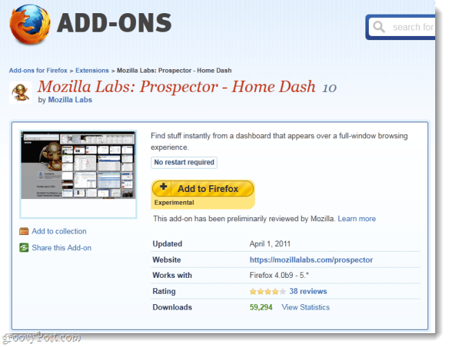
Have you ever felt that when a browser goes into full-screen mode it loses too much functionality to be effective? Or, another complaint might be that the interface doesn’t go away in all browsers. Mozilla has been working on an add-on for Firefox known as “Home Dash” that “attempts” to make a full-screen browser useful again. Home Dash is still in the experimental stages, so we don’t expect it to be perfect -yet. Home Dash is available for free on the official Mozilla Add-ons website. It is compatible with Firefox 4+ but should also work with 3.6 (if you haven’t upgraded yet, do it!). So far, they are keeping it up to date and it has some positive reviews.
Say goodbye to the interface
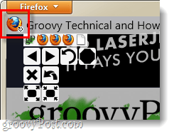
The first thing you need to know about Home Dash is that it completely clears out the normal Firefox user-interface. No address bar, no refresh button, all of it is toasted. What are left with is the notorious orange Firefox button, and a small icon that lets you open up a hover-over menu. You can access the menu by hovering your mouse over the small icon at the top-left of the browser. Instead of the typical navigation buttons, instead there are icons, and your tabs are also displayed as icons. We’ll call this the mini-menu since if you actually Click the tiny top-left icon it will open up a whole other set of options.
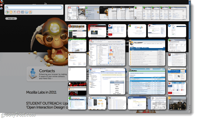
The real menu in Home Dash is accessed as mentioned above or by pressing Ctrl + L on your keyboard. The address bar is now located in it’s own little spot near the top-left and the tabs are displayed on the right. Mozilla’s preview screenshot shows 24 different websites open at once, all inside the browser. From what I’ve noticed this is entirely possible, but it will take quite a bit of work to set up properly, and it is hardly intuitive. There is also a strange site-preview scrolling feature that lets you view sites without actually switching your window to them.
More realistically, if you aren’t the type to open 20+ tabs at once you are looking at something similar to below. With a few tabs opened, you can then pint them by dragging website thumbnails to the smaller-boxes just to the left. Once you’ve done this Mozilla assigns a number to the tab. Each tab can then be opened using the Ctrl button plus that number. For example in the screenshot below Ctrl + 2 would switch groovyPost.
Disabling Home Dash
One really annoying thing about Home Dash is that there is no quick-intuitive way to switch it on and off. You really have two options:
Conclusion
Home Dash is definitely a neat experiment, but currently I can’t see it being practical for improving web-browsing efficiency –even in full screen mode. However, I do think Mozilla is onto something good here, but it should be geared more towards tablet PC’s; which are strongly increasing in popularity. At this point in development of the add-on I’m going to mark this one the same way Mozilla does, “experimental.” Don’t rush to download Home Dash yet, unless you have some spare time to kill and want to test it out. It could be big in the future, but it isn’t there yet. Comment Name * Email *
Δ Save my name and email and send me emails as new comments are made to this post.


